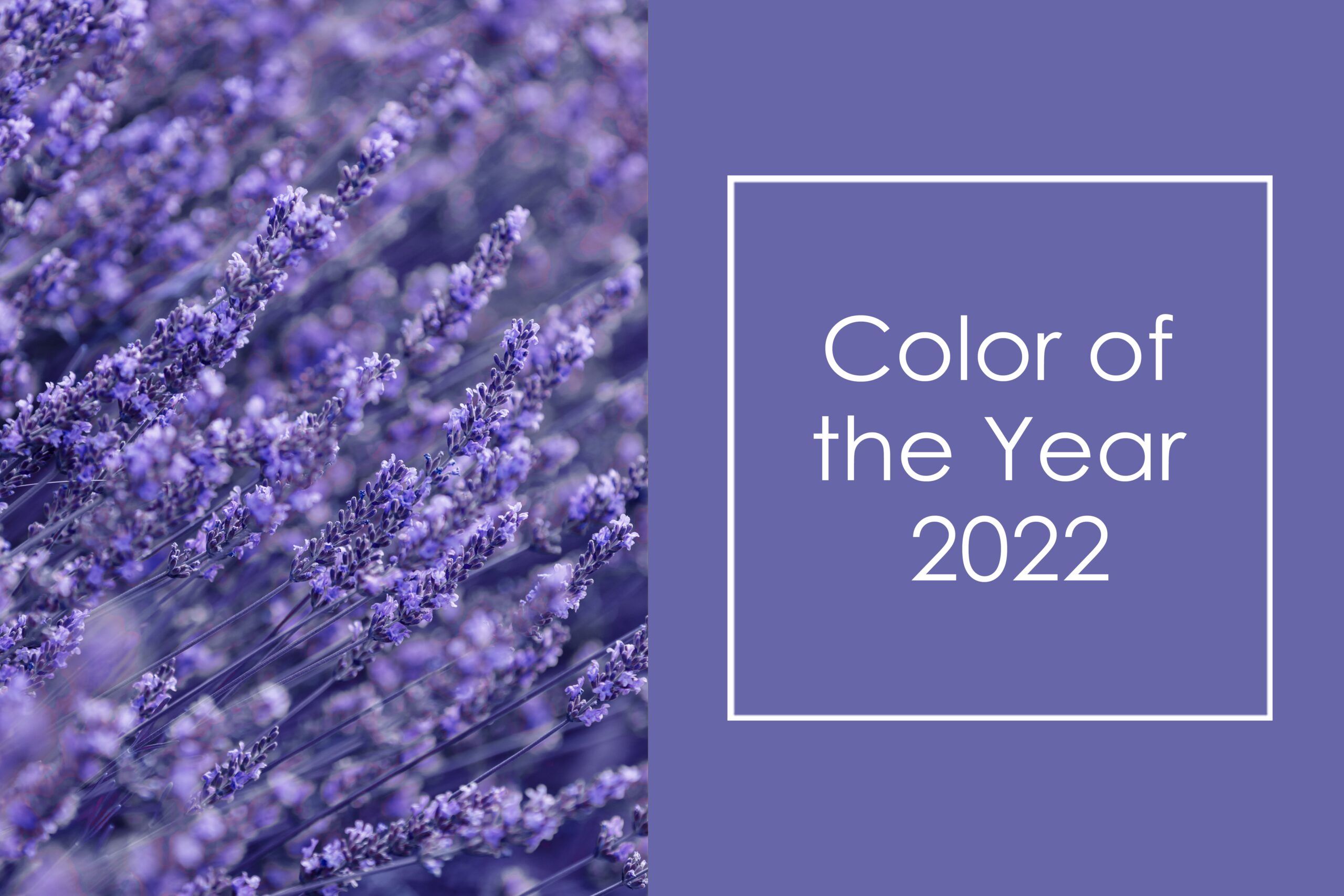
Color of the Year 2022

Each year, Pantone Color Institute chooses the trend color for the year.
Pantone is an universal color language that simplifies and harmonizes color-critical decisions at every stage of the work of brands and manufacturers. Pantone’s color language helps to define, communicate and control the unity of color from the moment of inspiration until the final realization of the idea.
For more than 20 years, Pantone’s color of the year has influenced product development and purchasing decisions in number of areas, including fashion, interior design, furniture and industrial design.
For 2022, Pantone Color Institute chose Very Peri (in translation “very periwinkle”) as the trend color of the year.
Featuring blue features but a purple-red undertone, the PANTONE 17-3938 Very Peri shows a bright, cheerful attitude and a dynamic presence that encourages bold creativity and imagination.
PANTONE 17-3938 Very Peri represents carefree self-confidence and courageous curiosity, which enlivens our creative spirit, curiosity and helps us to embrace this changed landscape of possibilities and new vision.
We have lived in a changing time, people’s perspectives and standards have changed, and our physical and digital lives have come together in a new way. Very Peri illustrates the fusion of modern life and how the color trends of the digital world manifest in the physical world and vice versa.
You can search similar laminate decors to Very Peri on our brands’ pages: Formica , Arpa , Homapal , Pfleiderer.
Read more on Pantone’s Webpage here.


